
Myrah Watches
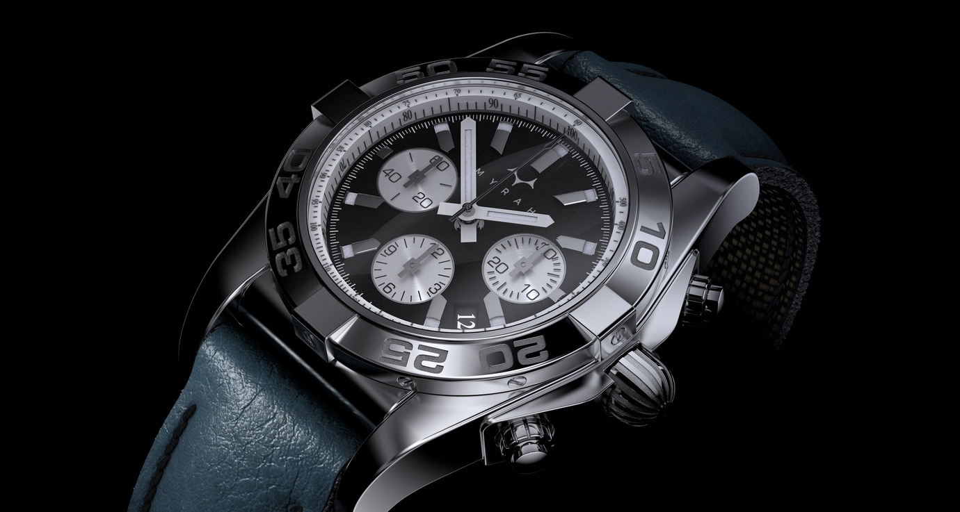
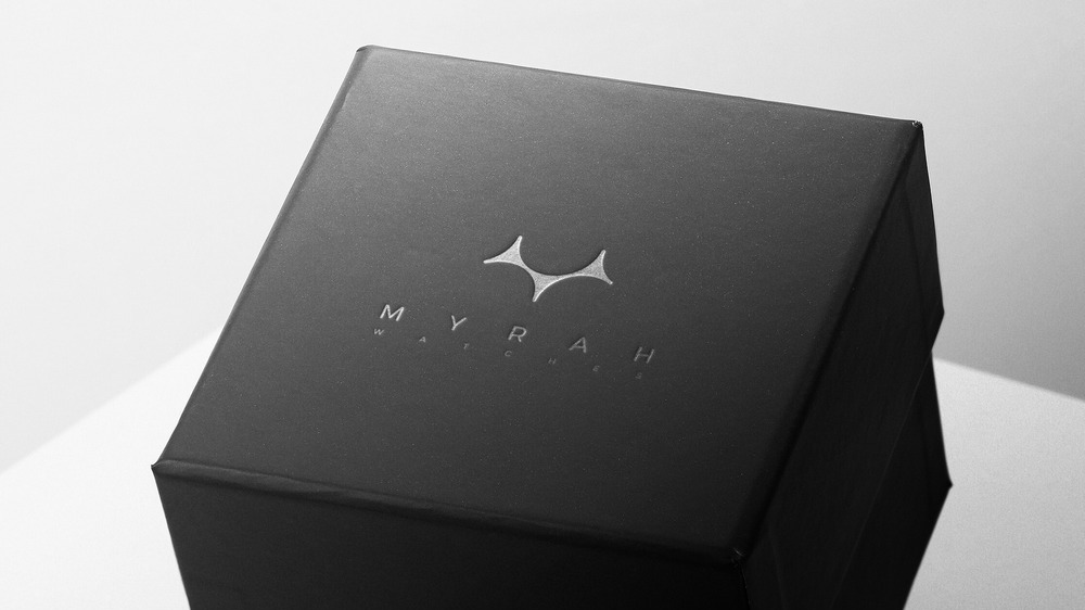
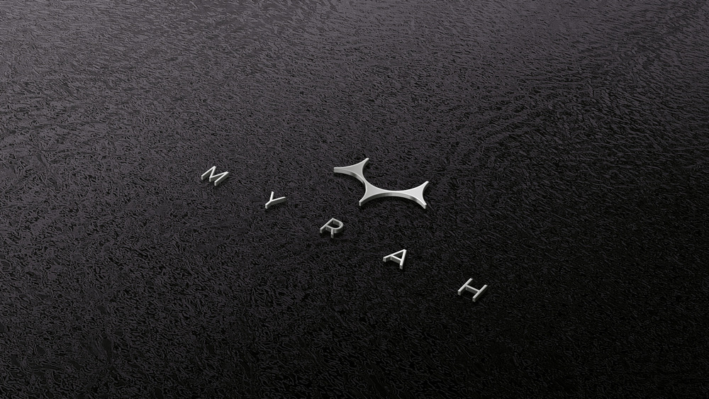
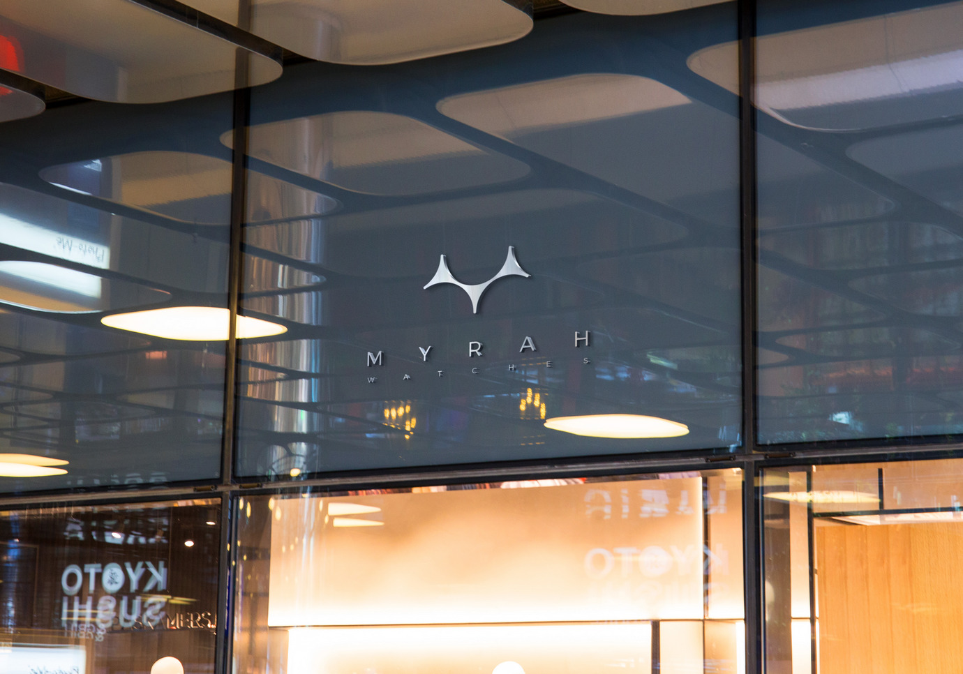
A symmetrical mark for a watch brand that asks you to look.
- Client
- Watch brand
- Where
- Product brand
- Scope
- LogoPackagingRetail
Mira is a young, artistic watch brand that values both precision and creativity. The name means "look" in Spanish - an invitation to appreciate the art of time and to look at it in a new, more inspired way.
The brand speaks to a broad audience, from 25 to 65, blending modern design with timeless elegance.
“We want a symmetrical design, or almost, in a pictorial mark style.”
The mark had to be
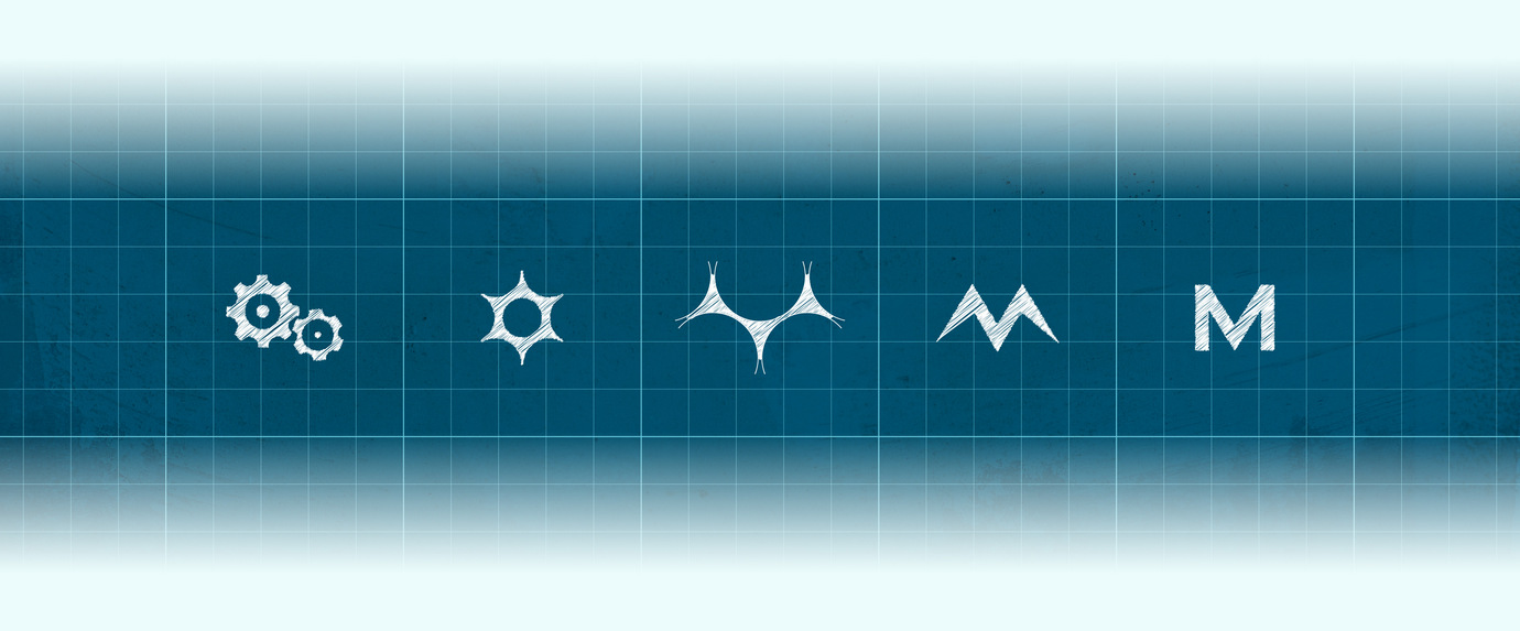
- 01Primarily symbolic: a simple, clear image that is memorable and visually representative.
- 02Balanced and ordered, reflecting both the precision of a watch and the harmony of art.
- 03Simple yet elegant, without overly complex details.
Next project
Entropy Gaming
Tell me about your brand.
The branding brief covers your business, audience, competitors and taste - with visual examples, so you can point instead of describe.
Takes about 10-15 minutes. Your answers are saved as you go.